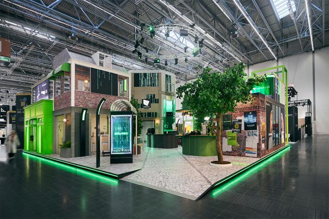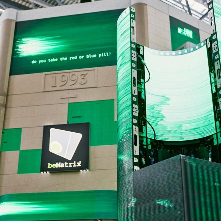
Clear and coherent message
Have you invested in beMatrix LEDskin® or appointed an AV bePartner to bring your design to life? In either case, you want to make sure you get the most out of your investment.
The first question you need to ask yourself is: “What do I want to use LEDskin® for?” This could be for promoting the company, boosting sales, announcing new products, or a variety of other purposes.
The purpose determines how you’ll deliver your message. Keep your message short, but powerful. This way, visitors will immediately and easily understand what you want to say and what they should do.
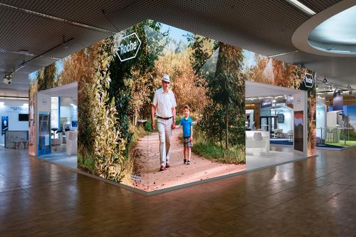
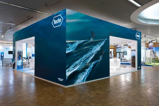
Exhibit builder Commercon Messebau from Germany has already created some great LEDskin® projects, such as the one for Roche. An impressive design made entirely of LEDskin® where various expressive images reflected Roche's character. This provides visitors with a clear message effectively communicated by their LEDskin®!
Use design principles
What exactly do we mean by “use design principles?” Design principles are standard design guidelines that we should follow for maximum message effectiveness. Given the versatility and numerous capabilities of LEDskin®, there are countless methods and techniques that can be used by advanced content experts. That said, this is a bit too far-reaching to fit into one article. Instead, we'll list the three most important ones for you that apply to the creation of your entire design, not just LEDskin®.
Colors
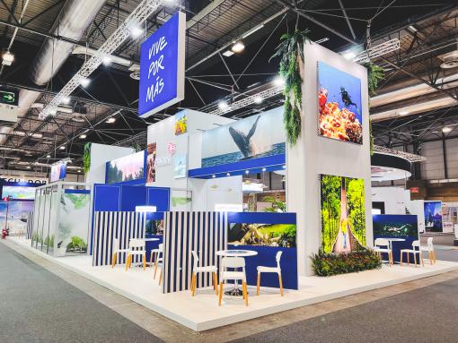
When creating content for your LEDskin®, it’s important to focus on contrast for your written copy. Specifically, try to keep your color palette to about 2-4 colors. This ensures an optimal display that is fine-tuned for readability. Headlines should use colors that promote legibility and best contrast. When creating these designs, it’s important to always choose colors from a brand guide so that you come across as recognizable and consistent.

Fonts
We’re big believers in letting images do the talking. As the saying goes, a picture is worth a thousand words. If you do need text, keep it to a minimum and be clear. Use your brand's fonts for better brand recognition and cohesion. Use no more than 2 fonts - one for your headline, and one for your sub headers and/or call-to-actions.
Layout
The third design principle we recommend is a good layout. Use symmetry and place elements evenly with the right hierarchy so that your message is seen. It’s also important to make call-to-actions that stand out.
Know the specs of your LEDskin®
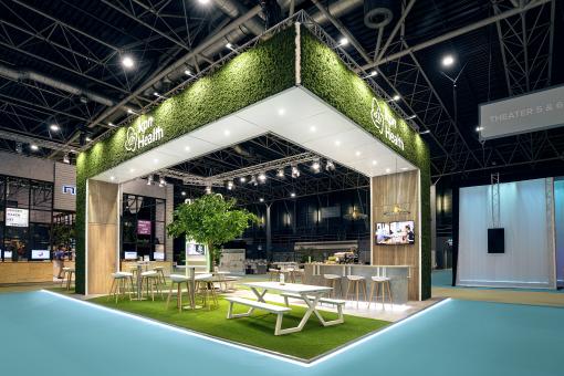
You can't just play every video on a different screen with different specifications. LEDskin® with different pitches or color tuning will result in the same video looking different on different screens. Optimizing your content according to the LEDskin® specifications will make your image look great and prevent extra pixelation or distortion. For us, we believe it’s best to leave this mostly to specialists who work on this day in and day out, but here are some things that a non-specialist should consider when thinking about video graphic specifications.
Ratio
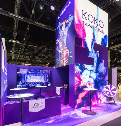
Knowing the proportions of your screen is crucial to properly displaying your video content. Most video content is displayed in a 16:9 ratio, but if you have a custom screen, your video ratio may be different. If you want a bit more movement in your design, you can opt for mosaics like MagnumLive or More Than Event. It’s important to keep in mind the areas that are left blank when creating the pixel map.
Pixel pitch
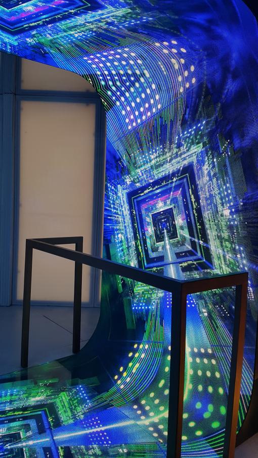
As of the writing of this article, LEDskin® tiles are available in 3 pixel pitches: 1.5, 1.9, and 2.5 mm. The pixel pitch of an LED screen is the distance between 2 consecutive LEDs, expressed in millimeters. This measurement gives you an indication of how sharp the image can be. For example, a LEDskin® tile with a pixel pitch of 1.9 mm means that the distance between 2 consecutive LEDs is 1.9 mm. The smaller the pitch, the closer the LEDs will be to each other and the more LEDs will be found in the same area. The smaller the pixel pitch, the higher the resolution of the image on the LEDskin®.
Resolution
As with pixel spacing, the larger your LEDskin® screen is, the higher the resolution your content needs to be. If you are testing content and it is grainy or blurry, you probably need to increase the resolution. This is expressed in pixels. You can find all the technical specifications of LEDskin® on page 19 of our AV Solutions brochure.
Use transitions
When it comes to using LEDskin® in your designs, such as gif animations and videos, you want to add nice transitions between each piece of content. For example, a nice transition is easier on the eyes rather than abrupt, sudden cuts between videos.
Apart from smooth transitions, you also need to make sure you time the different content so that people have enough time to read it. Transition too fast and you lose the chance to get your message across, but transition too slow and you lose your audience.
At EuroShop, we chose to incorporate 3 different settings/scenes. We played each scene 15 minutes apart to ensure maximum visitor attention. Then, with each scene change, visitors’ attention refocused on our exhibit ensuring that all eyes were on us. Since everyone had the opportunity to take in the original scene, they were pleasantly surprised to see the content change. And when the scene came on screen, everyone pulled out their smartphones or stopped talking for a moment to watch our content.
Test before use
It should go without saying, but test, test, test! Like a test build, it's best to test out your content beforehand. Be sure to weigh the costs and benefits, as a test build can be expensive and unnecessary.
Trends 2024
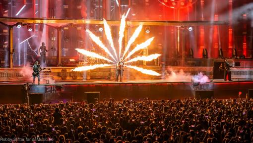
Each new year comes with new trends. Below, we list the 3 most entertaining ones for 2024. Lots of flash, fireworks, and "is this real?" moments are trending for this upcoming tradeshow season! Get inspired and be this year’s trendsetter.
More flash than ever
Simple stage design won't draw in the crowds these days. The most frantic sets, endless fireworks shows, and LED screens draw eyes to your designs more and more.
Combination with AI
There are more and more technical solutions to make it easier for speakers and audiences to follow along. For instance, there are tools such as Wordly that offer live AI translations in audio and subtitles. This brings new challenges into play since designers need to update the content on the LED screens as quickly and as perfectly as possible. More in-depth knowledge into this kind of technology is required.
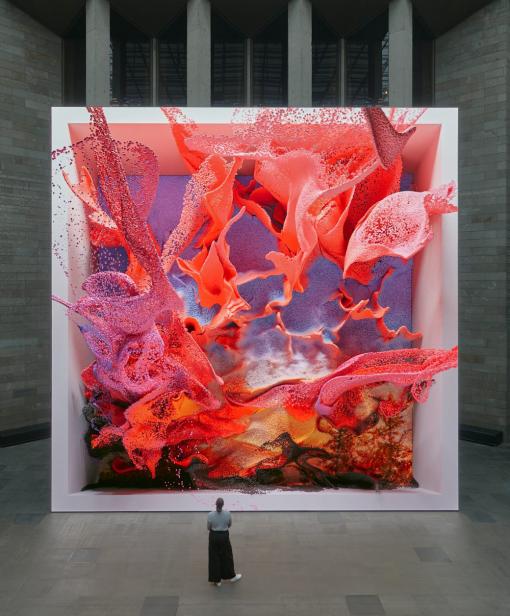
AI generated work is the future. For example, here we have Refik Anadol's Unsupervised LED wall. This artist used artificial intelligence to interpret and transform more than 200 years of art at MoMA.
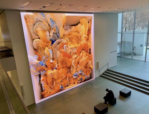
Anadol trained a sophisticated machine-learning model to interpret publicly available data from MoMA's collection. As the model "walks" through its own interpretation of MoMA’s entire catalog, it reimagines the history of modern art and dreams about what could have been - and what might come. Be sure to check out the stunning result by clicking on the picture!
Immersive experience
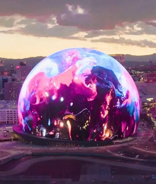
Dull, black backdrops are increasingly being replaced by LED screens that adapt to the mood of the room or the speaker's presentation. We recently saw an extreme case study of this in Las Vegas, where U2 performed in the $2 billion 'Sphere' theatre. The 1.2 million LED lights there created an unprecedented experience.
"It’s like watching a live show with VR glasses on!" From the moment you enter the auditorium, you sense that it's going to be something intense and you're standing there with your mouth full. You get sucked in, so to speak. A seed has been planted with many event organizers.
10 cool AI and blockchain tools
To help you on your journey, we would like to introduce you to some new tools that you can use at your next event. Jan Scheele, entrepreneur, event organizer, TEDx host, crypto specialist, and so much more, wrote an interesting article about his 10 favorite AI and blockchain tools for events.
According to him, not utilizing these new technologies at your next event will leave you missing out. Client demands have only increased and the good-ol’ classics won't get you there. Get inspired by his favorites via the link below. (The following webpage is written in Dutch).
Jan Scheele's favourite AI and blockchain tools

Looking for skilled experts in LEDskin® content? Hit up one of our partners in our bePartner network! We work with providers across the globe. Be sure to take a look at our website.
Are you an expert in LED content, been in the business for several years, and would you like to join our network to expand your market? Then be sure to fill in the form at the bottom of our website and we will reach out to you!
Sources
- Firefly LED: https://fireflyled.com/2022/06/5-tips-for-creating-content-for-your-led-display/
- DACA Ledscreen: https://www.daca-ledscreen.be/nl/wat-is-een-pixel-pitch#:~:text=De%20pixel%20pitch%20van%20een,2%20opeenvolgende%20LED's%208mm%20is
- Frankwatching: https://www.daca-ledscreen.be/nl/wat-is-een-pixel-pitch#:~:text=De%20pixel%20pitch%20van%20een,2%20opeenvolgende%20LED's%208mm%20is
- MOMA: https://www.moma.org/calendar/exhibitions/5535
- VRT: https://www.vrt.be/vrtnws/nl/2023/10/04/concertzaal-the-sphere-las-vegas-belgische-technici/
Copyright © 2025 beMatrix. All Rights Reserved. Cookie policy - Privacy policy - Terms & Conditions
